IMPACT
BACKGROUND
Revamped referral program for seamless expansion to 8 states as it scaled to reach 5.8 million users in the US.
TIMELINE
June - August 2022
June - August 2022
DELIVERABLE
Native & desktop web design
Native & desktop web design
OUTCOME
Improved sign-up rate by 14%, launched in Q3 2022
MY ROLE
UX UI Design, Research Synthesis, Ideation, Competitor Research, Prototyping, Design Critique Workshop, Ideation Workshop, A/B Testing
UX UI Design, Research Synthesis, Ideation, Competitor Research, Prototyping, Design Critique Workshop, Ideation Workshop, A/B Testing
TEAM
1 Product Manager, 1 Content Designer, 1 Data Analyst, 5+ Engineers
1 Product Manager, 1 Content Designer, 1 Data Analyst, 5+ Engineers
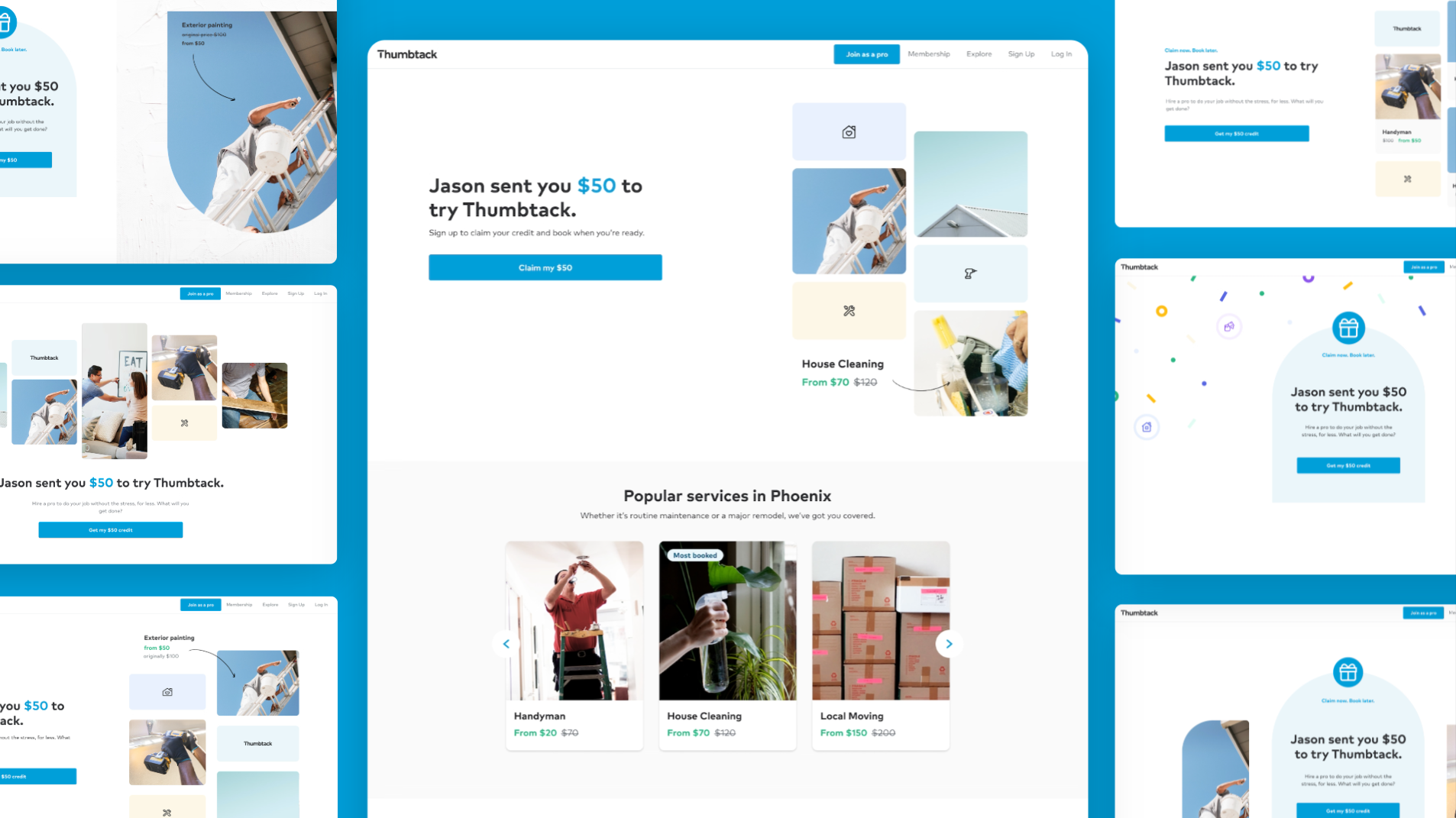
Final Web Design
01 / BACKGROUND
Overview
Thumbtack is a leading home service marketplace platform that connects over 1 billion customers across the United States and Canada with skilled professionals.
As the lead designer for the referral program in the Customer Acquisition team, I worked closely with the team to scale new, high-margin growth loops that produces accelerated customer growth.
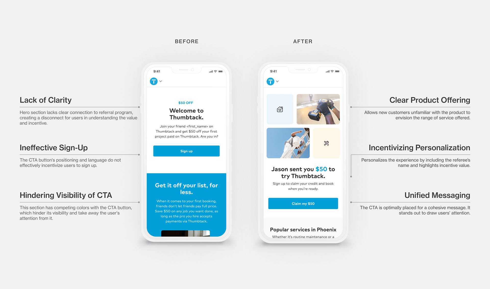
Original Design
Problem
The value proposition wasn't effectively communicated through the original design, leading to a lack of user engagement and a low conversion rate. This issue directly impacts the business's growth funnel.
Goal
Increase sign-up rate by redesigning the customer referral program as it expands from 6 to 8 states in the U.S, with a potential reaching 5.3 million users.
02 / RESEARCH
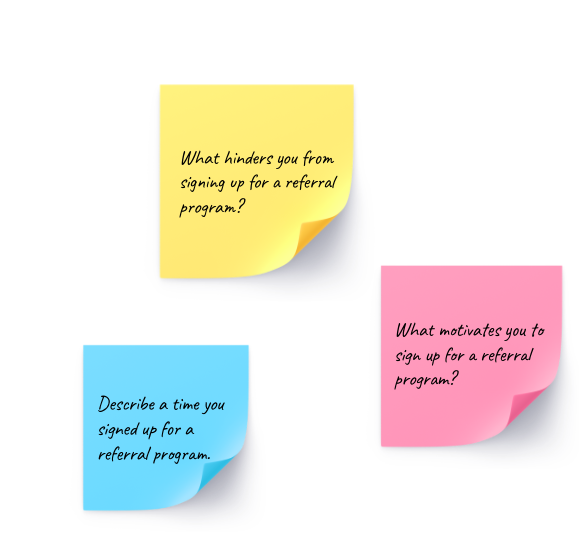
user research synthesis
Uncovering Customer Insights
Uncovering Customer Insights
The research team spoke to customers who have used referral programs in the past. Participants were asked to walk through their experience and in what circumstances they are likely to sign up via a referral link.
Key insights:
• 70% of participants preferred a tangible $ amount discount to a % discount.
• 55% of participants signaled they refer people situationally, often after having a conversation with a neighbor, family member, or friend who needs certain services.

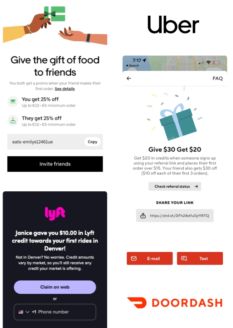
Competitor RESEARCH
Analyzing Referral Program Strategies
Analyzing Referral Program Strategies
To identify common patterns in consumer-focused product referral programs, my content design partner and I examined referral programs from reputable B2C companies such as Lyft, Uber, and DoorDash.
Key themes include:
• The idea of "gifting"
• Personalization
• Social proof
• Clear value proposition
• Double-sided incentive
.03 / EXPLORATION
brainstorming workshop
Identifying Common Patterns
Identifying Common Patterns
To improve the experience of the product, I took a proactive approach to understanding common patterns that could inform design decisions.
I leveraged the insights from the existing research and led a design workshop with my content design partner to further develop the design concepts that could drive higher conversion.

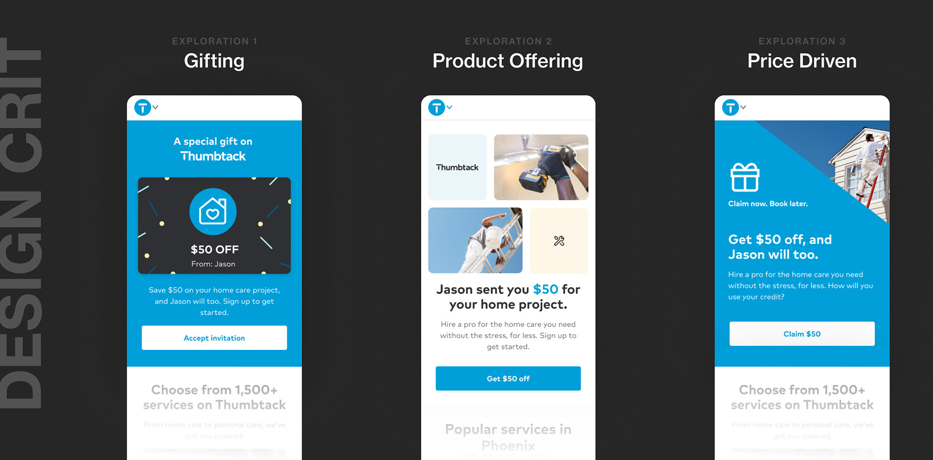
Key Design Insights
🎁 Gifting
One effective way to increase customer referrals is through personalized gifting, as shown in research, since people have a tendency to feel special and valued when receiving a personalized gift from a friend.
🎖 Product Offering
Visual representations of the product's offerings and services can help users quickly grasp its value and benefits, increasing the likelihood of conversion.
🏷️ Price-driven
Customers are more likely to take advantage of sales and discounts, so offering a discounted price or promotion can motivate them to sign up.
hypothesis
By personalizing content, improving the clarity of the product offering, and visually showcasing cost savings, new users are more likely to sign up and adopt the service, resulting in new growth margins.
By personalizing content, improving the clarity of the product offering, and visually showcasing cost savings, new users are more likely to sign up and adopt the service, resulting in new growth margins.
04 / DESIGN
design refinement
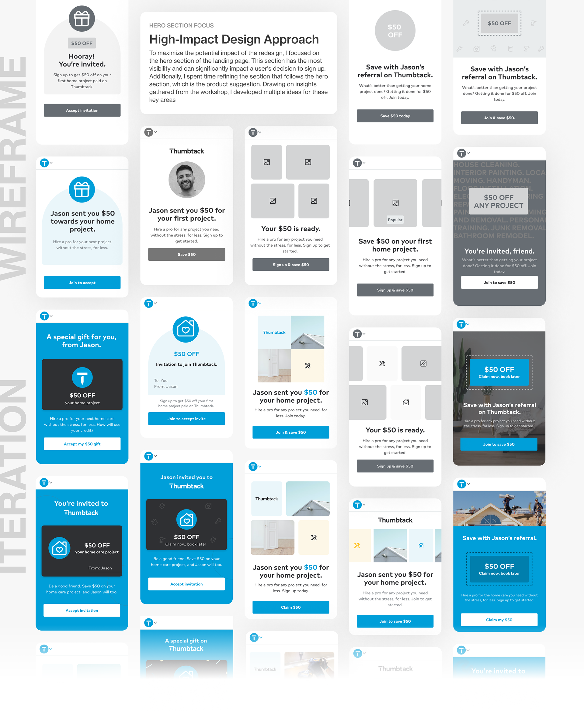
Gathering Feedback at Design Critique
Gathering Feedback at Design Critique
After multiple iterations of wireframes and high-fidelity designs where we consistently sought feedback from the product and design team to ensure alignment. My content design partner and I presented our design at a design crit to gather additional perspectives. We then organized the feedback into categories for UX, UI, and content, which enabled us to refine and solidify the final design.
After analyzing all the feedback, we concluded that the second exploration - the product offering theme, is the most robust design solution. This design not only addresses the problem from the original design of lack of user engagement but also effectively showcases the brand and product in the most comprehensive way compare to the others. Moreover, it aligns with other entry points of Thumbtack, which is essential to take into consideration from a system design perspective.
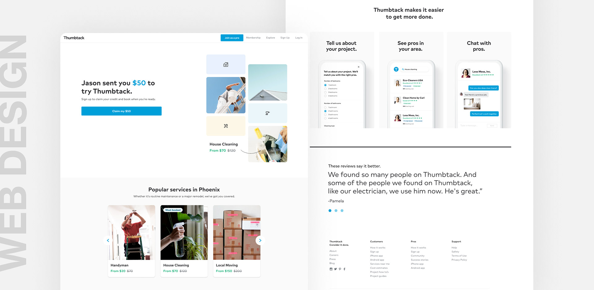
desktop web design
Translating Design from Mobile to Web
Translating Design from Mobile to Web
I explored several variations of the website design that incorporated elements from the three themes: gifting, product offering, and a price-driven approach and feedback from design critique. I found designing for desktop web enjoyable because it offered a larger canvas to incorporate design elements that would not necessarily work well on smaller screen sizes. For example, I used a hand-drawn style arrow to point to the image and highlight the discount.
other entry points
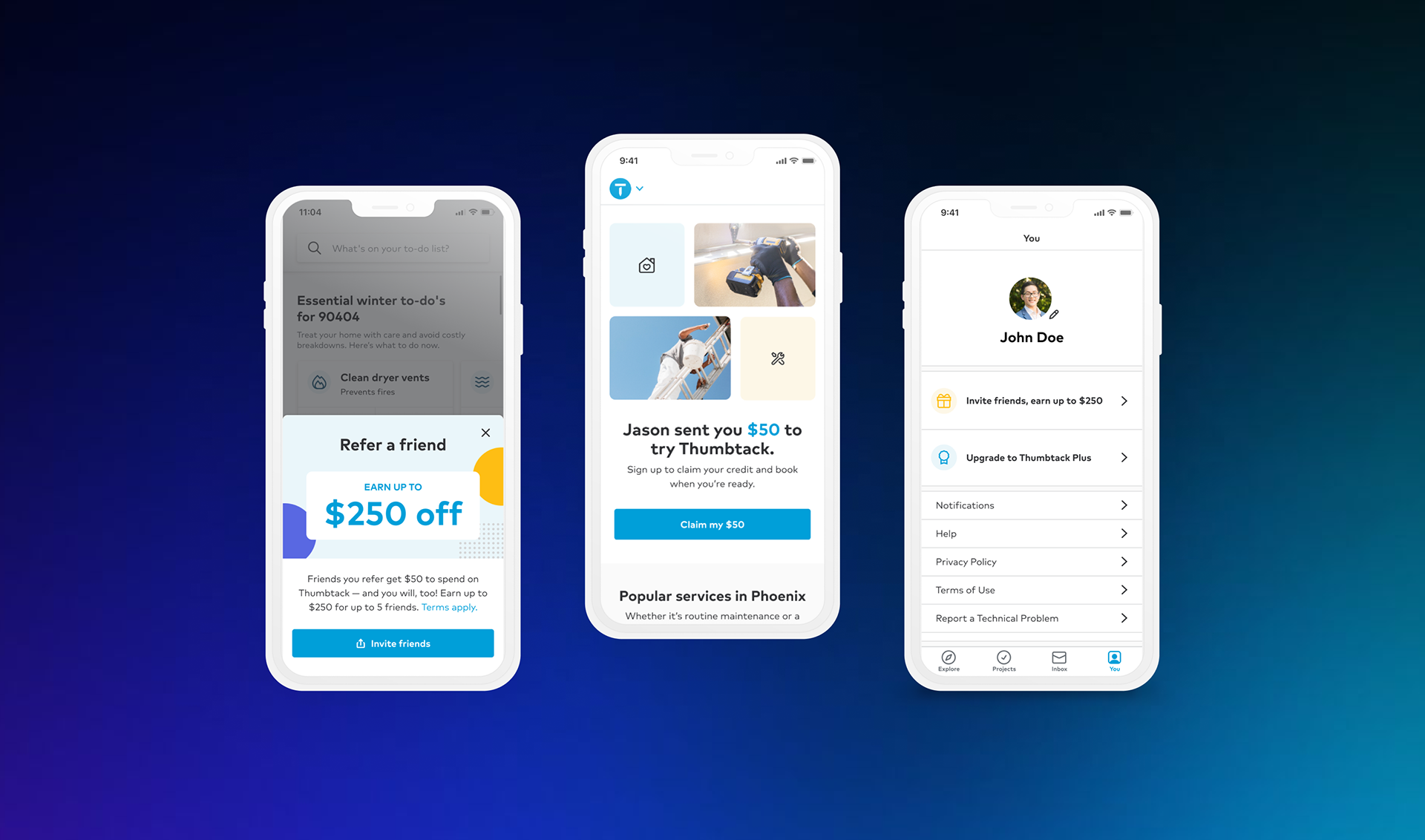
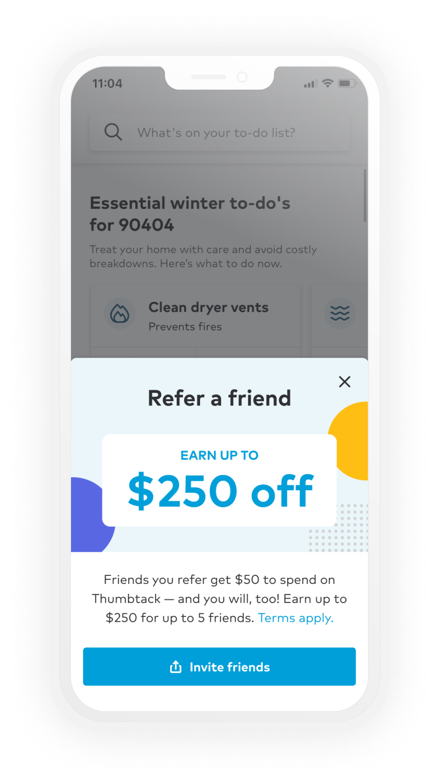
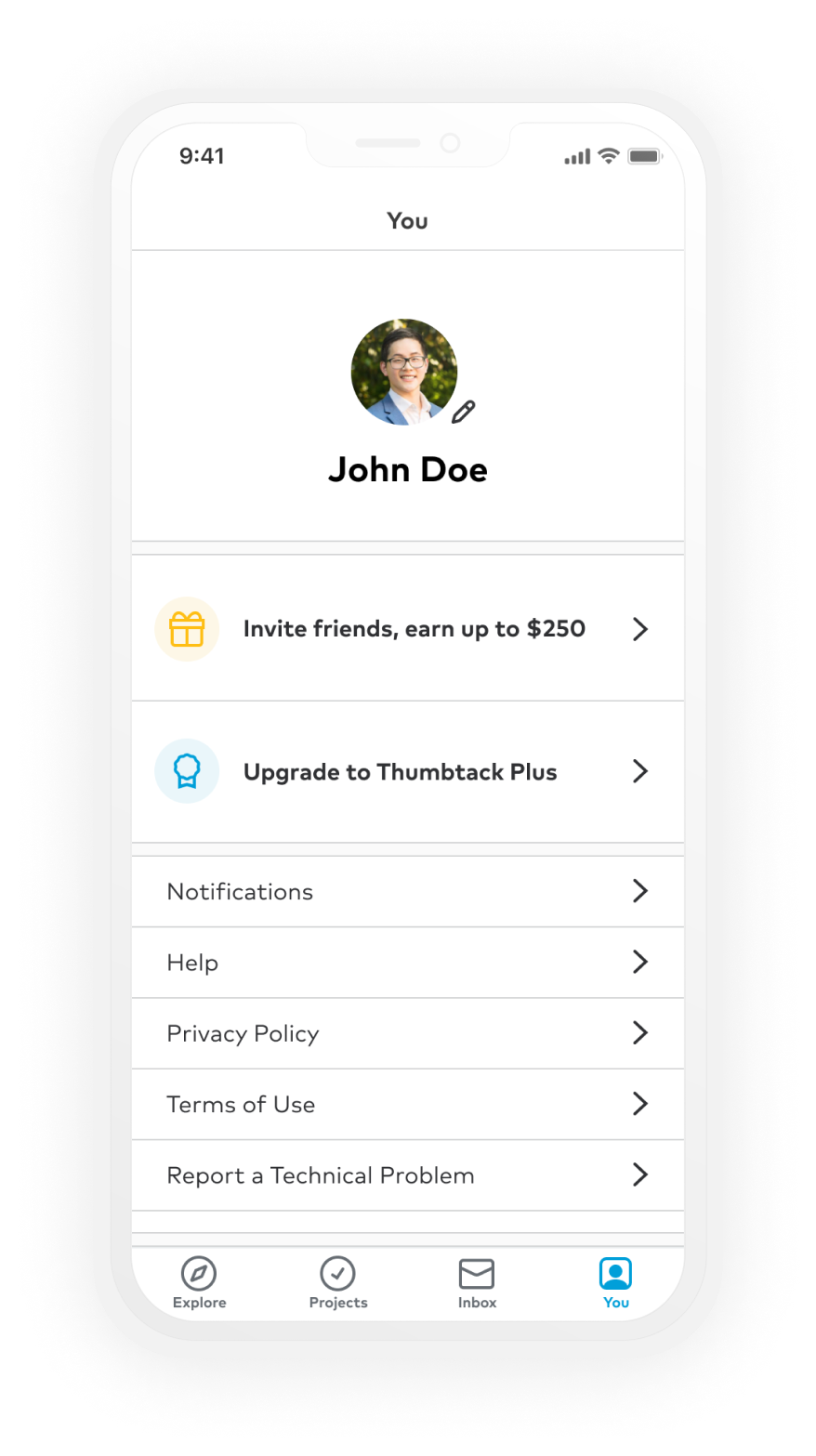
Driving Customer RetentionI led the design of 2 other growth optimization projects focused on enhancing the customer referral program. The projects targeted high-visibility touchpoints, such as login and profile tab, to maximize the potential of customer acquisition.
The design resulted in a nationwide release and yielded a substantial impact, reaching over 5.8 million users in the US.
Login Prompt
Created a brand new entry point that prompts users to interact with the referral program upon login.
Profile Tab
Improved referral visibility on profile page, collaborated with Thumbtack Plus to restructure hierarchy.
05 / SOLUTION
06 / IMPACT

New Design Boosts Sign-Up Rate by 14%
After conducting an A/B test on the market, the new design outperformed the old design in both click-through rate and sign-up rate. This led to a 14% increase in the sign-up rate, and also contributed to improving the retention rate by 3% by specifically making the referral program more visible throughout the experience.

What I've learned
🖇 Consolidating Design Feedback
By analyzing design critiques for common themes in visual, UX, and content design, I learned to consolidate feedback and turn it into actionable items for my next iteration. This approach allowed me to back up my design decisions with evidence and create a more effective design.
🔦 Distilling Explorative Designs
During the exploration phase, I explored multiple design solutions and struggled to narrow down the abundance of options. I compared the different designs to find the best solution and developed a keen eye for identifying the strongest designs by revisiting the problem statement and hypothesis, bringing them to design critiques to receive the most efficient feedback. This experience helped me to refine my design skills and ensure that the final product met the project's objectives.
🤝 Collaborating with Content Design
I have learned the importance of creating a consistent message that effectively communicates the product's value proposition through working closely with my content design partner. Copy and visual/ UX design must go hand in hand in order to make the entire design cohesive and understandable.

